Project Description
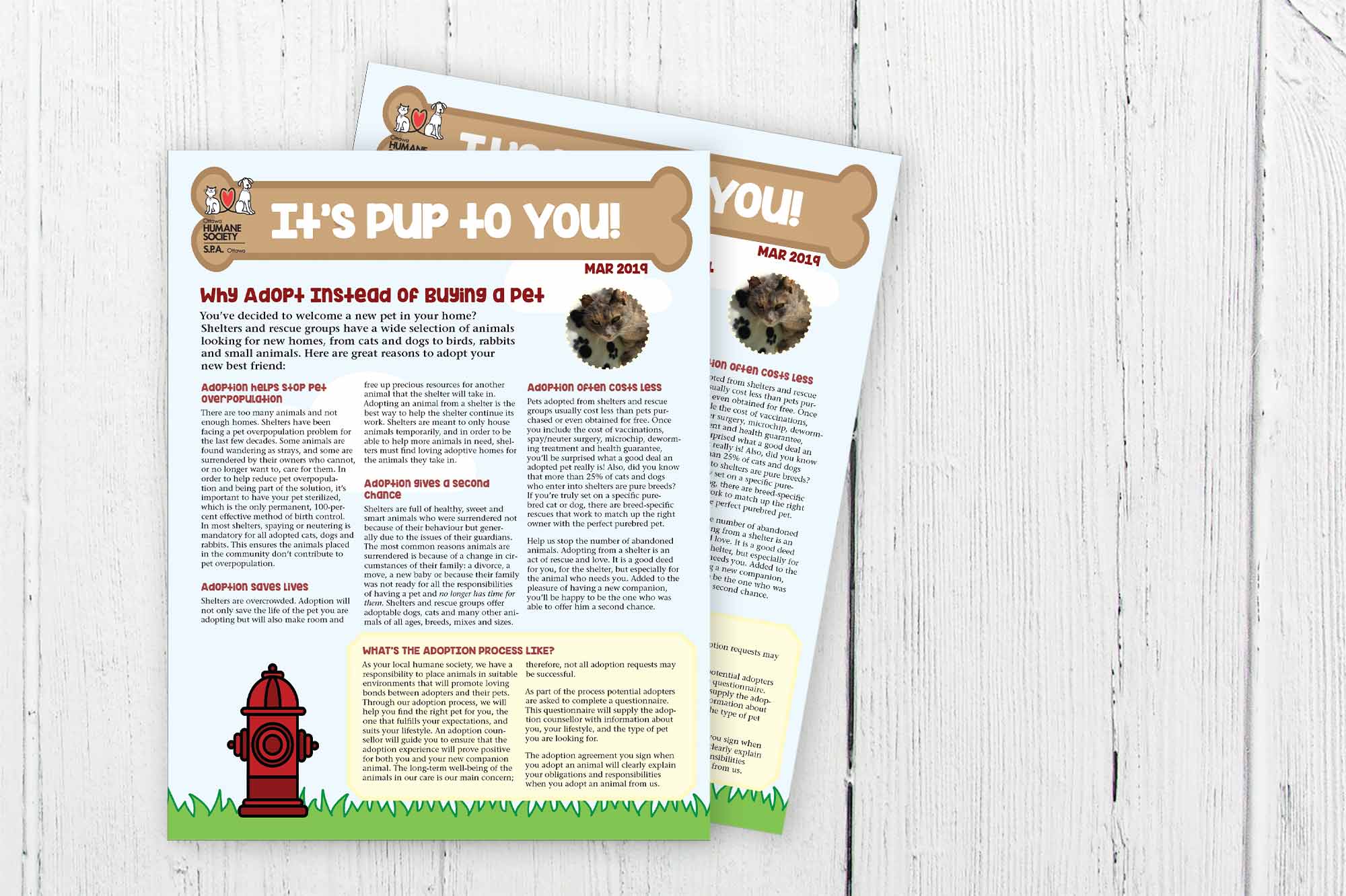
The Ottawa Humane Society (OHS), is an organization dedicated to rescuing animals. A large part of their job, other than helping stray pets, is to find them loving, forever homes. Though the adoption process can seem scary or long, the OHS wants to show that the process isn’t as bad as they think, and talk about the benefits to adopting a pet rather than buying.
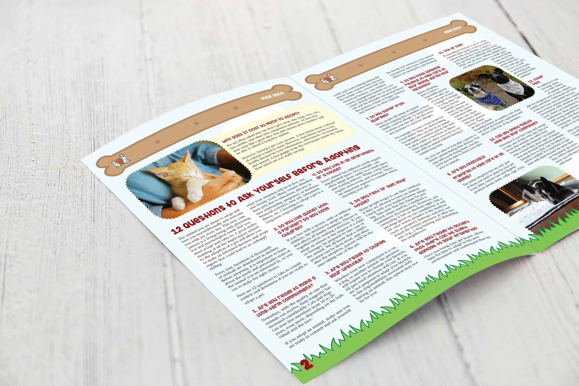
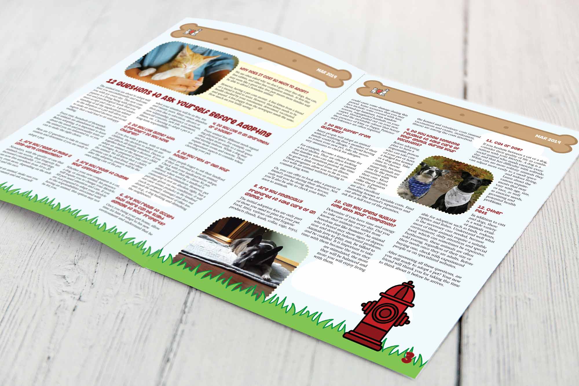
To do so, the OHS wants to create an adoption-themed newsletter. Using information provided by the OHS, a fun and playful what to know about adoption newsletter will be designed to boost pet adoption.
Deliverables
- Illustrations, photos, and catchy title for newsletter
- 11” x 17” newsletter (folded like a book, double-sided)
My Goals
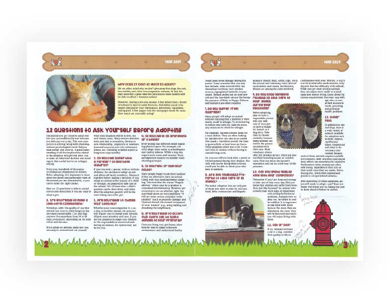
My goals for this project were to create a playful pet-themed newsletter that would be informative and fun. I wanted to make the information more digestible with the use of fun colours, cute animal photos, and themed illustrations.
The Process
To start, I knew I wanted to keep the overall design very fun and playful to show the joy that adopting a pet brings. I did some research into the OHS, to get an idea of their overall brand.
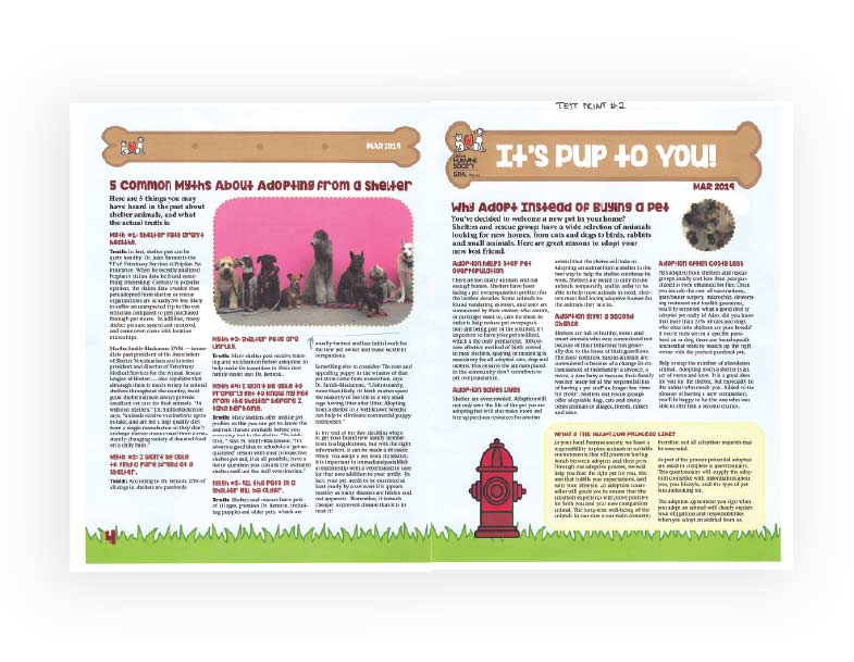
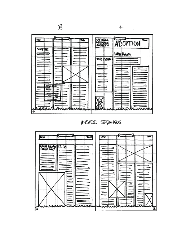
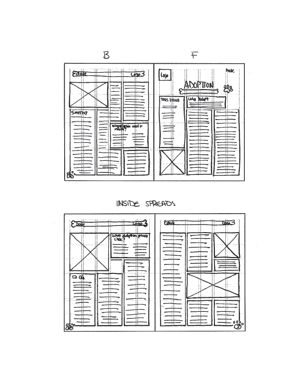
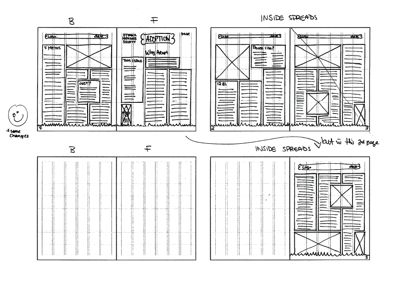
Then I moved on to sketching (the best way to get all your ideas out!). I sketched 3 different layouts, and ultimately decided the third was the best, with some minor changes.
With the layout design approved, I started to build the newsletter. I designed some fun illustrative pieces, like grass and a fire hydrant, and got some cute pet photos together. I chose a playful typeface for heading, and a good, readable typeface for the body copy. With one last final approval of the design, the newsletter was complete!

Challenges
There was a good amount of information that had to fit into the newsletter, trying to give everything the right spacing was a bit challenging.
Final Thoughts
I really enjoyed designing this newsletter. It allowed me to create something super playful and fun. I think it really captured the spirit of the OHS and the adoption process. Adopting a pet should be a happy and fun experience, and I think this design really shows that, while giving you all the important information on adoption.
