Project Description
The Ottawa International Animation Festival (OIAF) is a yearly festival to showcase cool and interesting animation. They recently celebrated their 40th anniversary, and were wanting to create a design for the festival celebration.
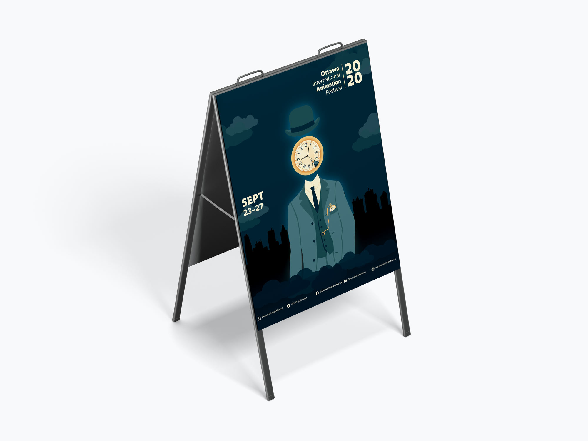
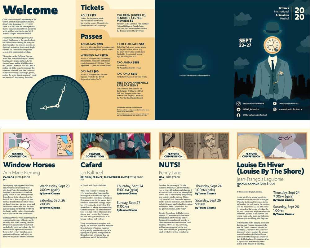
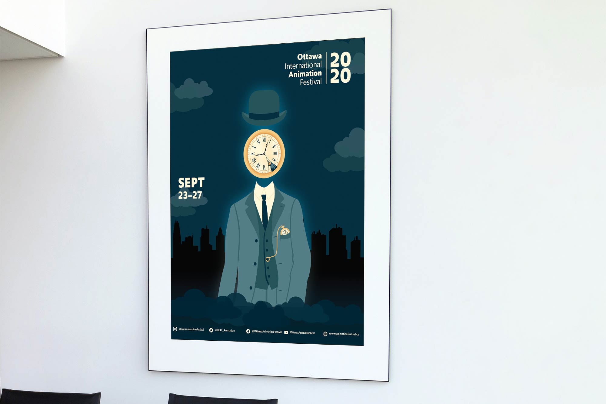
To do so, OIAF is looking for a fun posterzine that showcases the festival and all the films being shown. The posterzine will consist of a 22” x 17” full-size poster on one side, and a brochure with festival information and featured films on the other side. This would all fold up into a brochure that when fully opened, will show the poster on the back.
Deliverables
- Illustrations and layout design
- 22” x 17” posterzine (double-sided)
My Goals
My goals were to create an eye-catching poster that would interest people to look at, and have them flip through the posterzine, learn more about the festival, and decide to buy a pass.
The Process
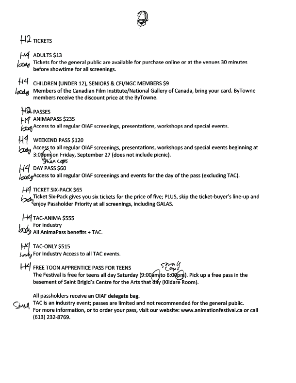
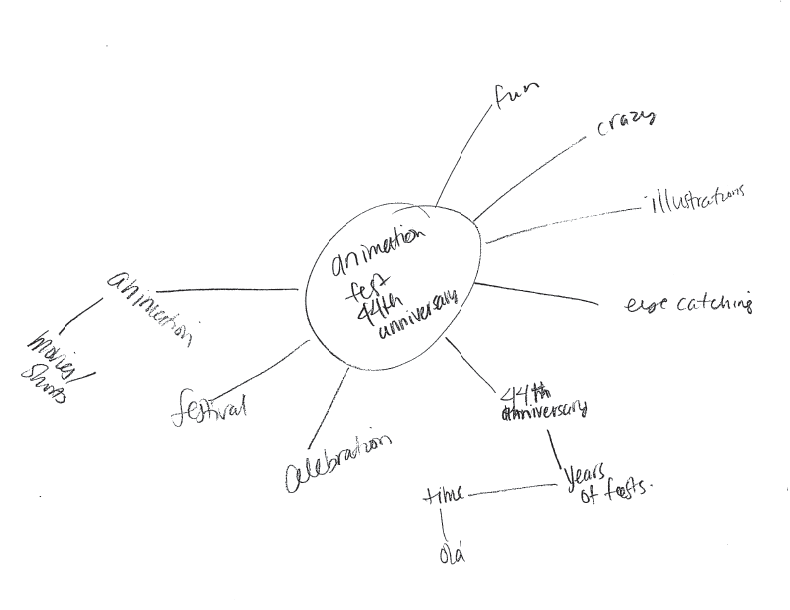
First, I started with research to get a feel for OIAF and their brand. I looked at previous posters to see what was typically designed so that I could design something different. Looking through previous posters, I noticed they didn’t stick to one specific style, rather they showcased different designs every year, but they did like weird (which was good for me, I can do weird).
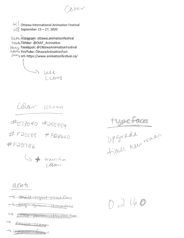
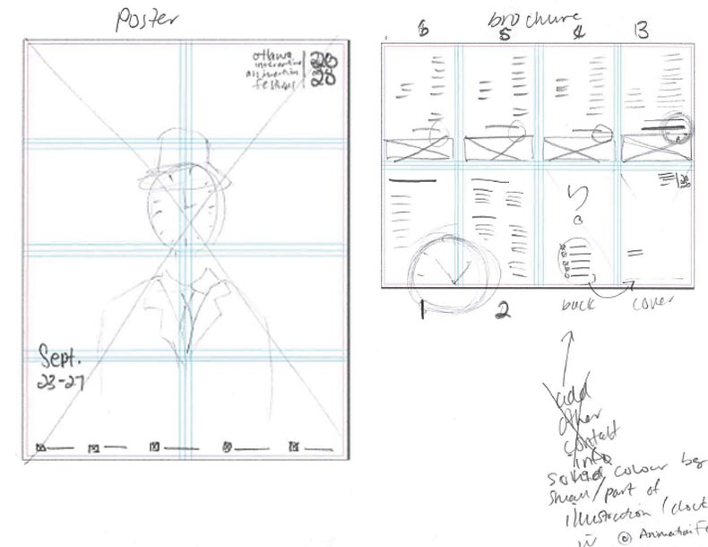
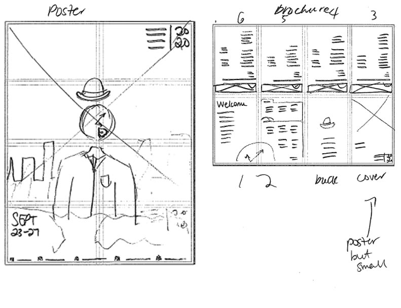
So with that in mind, I started sketching. I wanted to create an interesting design that centred around the theme of time (because it’s their 40th). After sketching a few layout designs and my illustration and getting approval, I started to build my posterzine.
I picked a dark colour theme that fit well with the design, and picked fonts that were readable and simple to not distract from the main illustration. I used grids to make sure all the pieces lined up nicely and looked clean. And then I added all the illustrations, images, and text into the final posterzine layout.

Challenges
With the limited space on the poster, fitting all the information given and making sure they had good spacing was a challenge.
Final Thoughts
I think this posterzine turned out very successful. It fully encompasses the interesting brand that is OIAF. The final illustration is also very eye-catching with the contrast of the dark background and light clock face, which would make me want to read the posterzine.
