Project Description
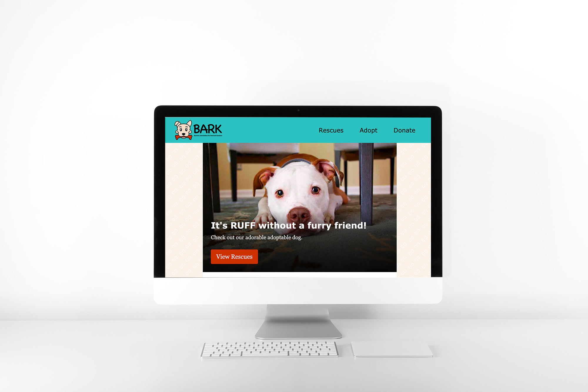
The Bytown Association for Rescued Kanines (B.A.R.K.), is an Ottawa-based no-kill animal rescue. The team consists of mostly volunteers, who work tirelessly to help dogs in need. But their website needed a little rescuing.
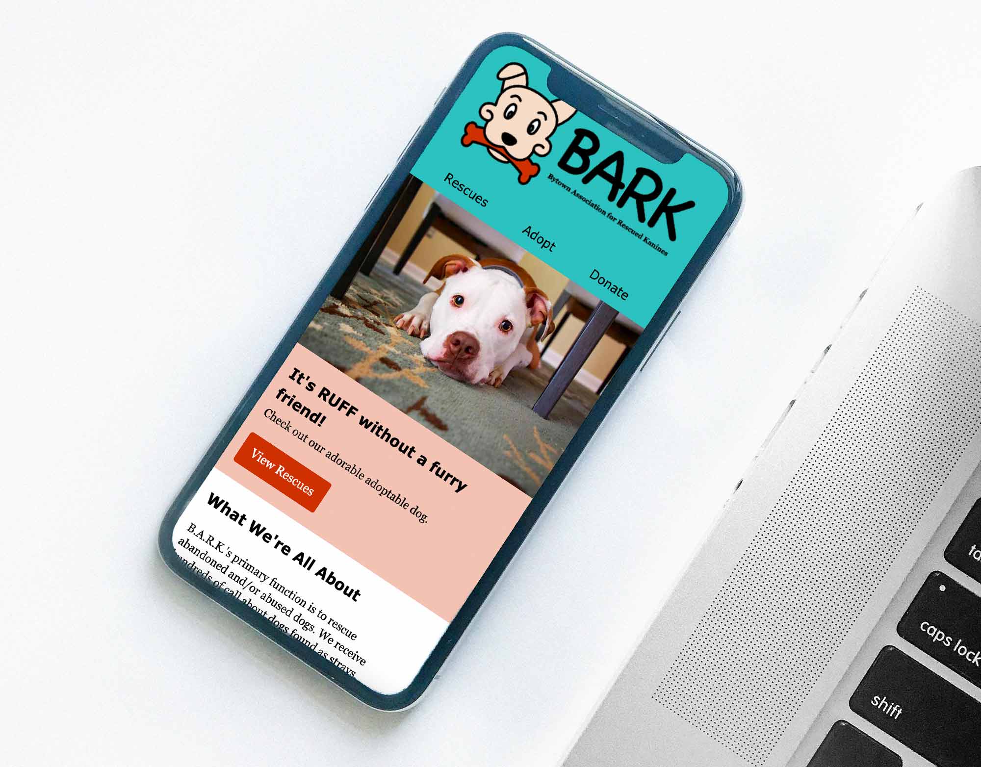
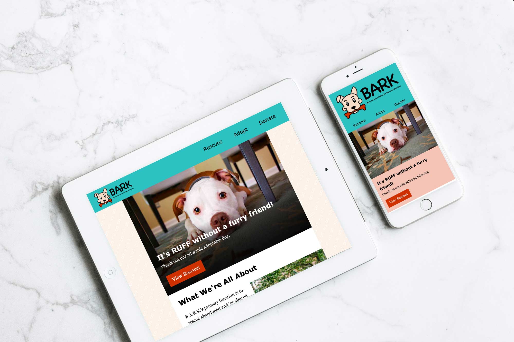
The current website didn’t represent the brand in the way that it could, so redesigning the site to fit with their brand and showcase the amazing things they do was the goal.
Deliverables
- New logo design
- Redesigned website consisting of a home page, an adoptable pets page, and an adoption form page
My Goals
My goals for the redesign was to create an inviting website that would get people to stay, look through the available dogs, and maybe even put in an adoption application for a dog.
The Process
To start, I did some research on other organizations that are considered B.A.R.K.’s competition. This gave me a better idea of what to do and not to do, so that B.A.R.K. could stand out from other rescues.
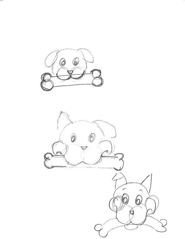
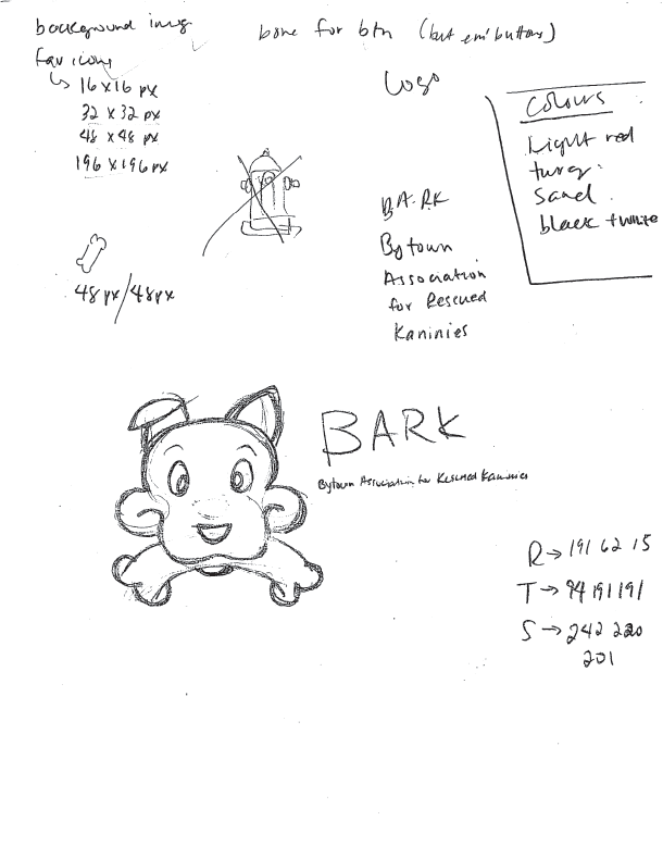
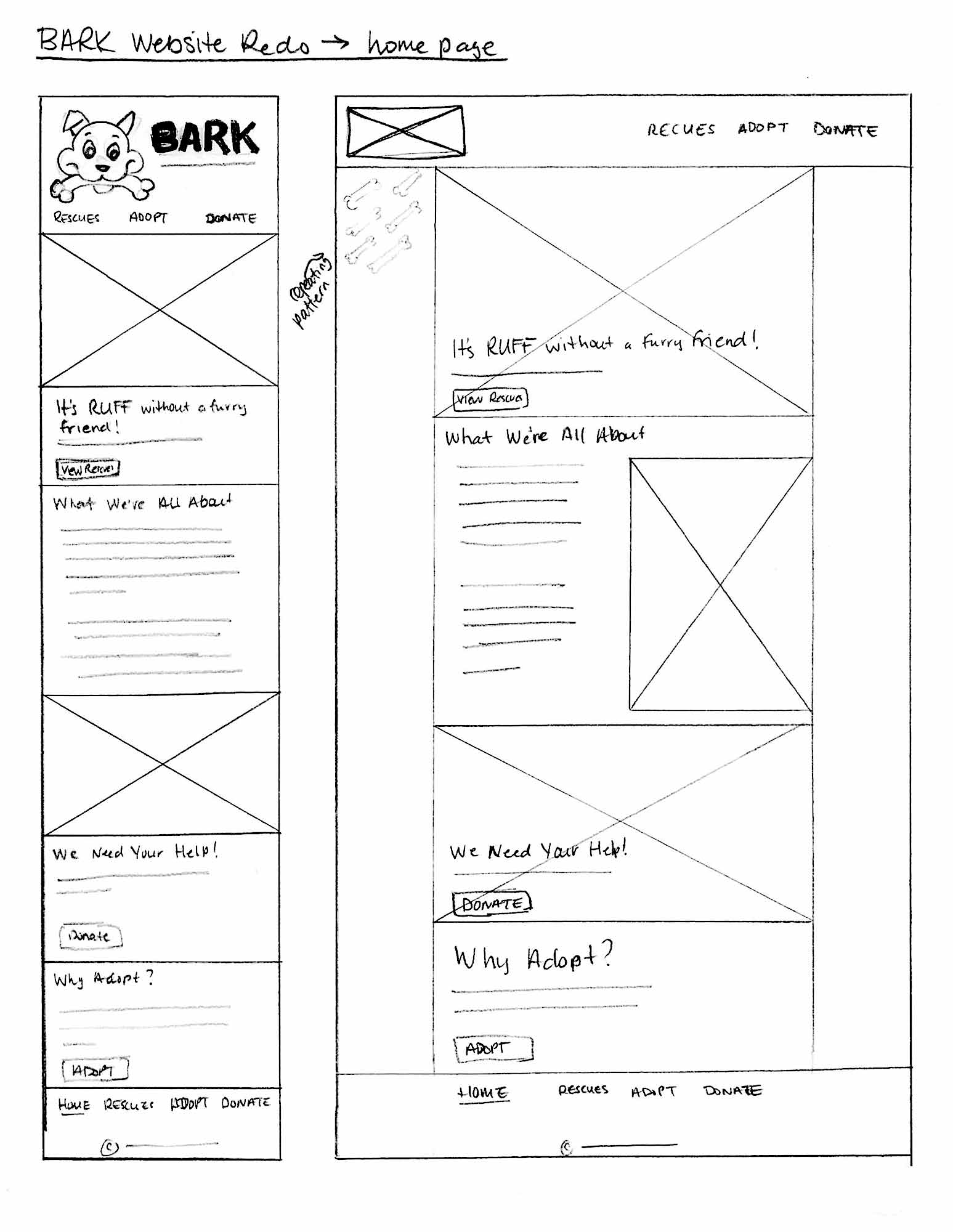
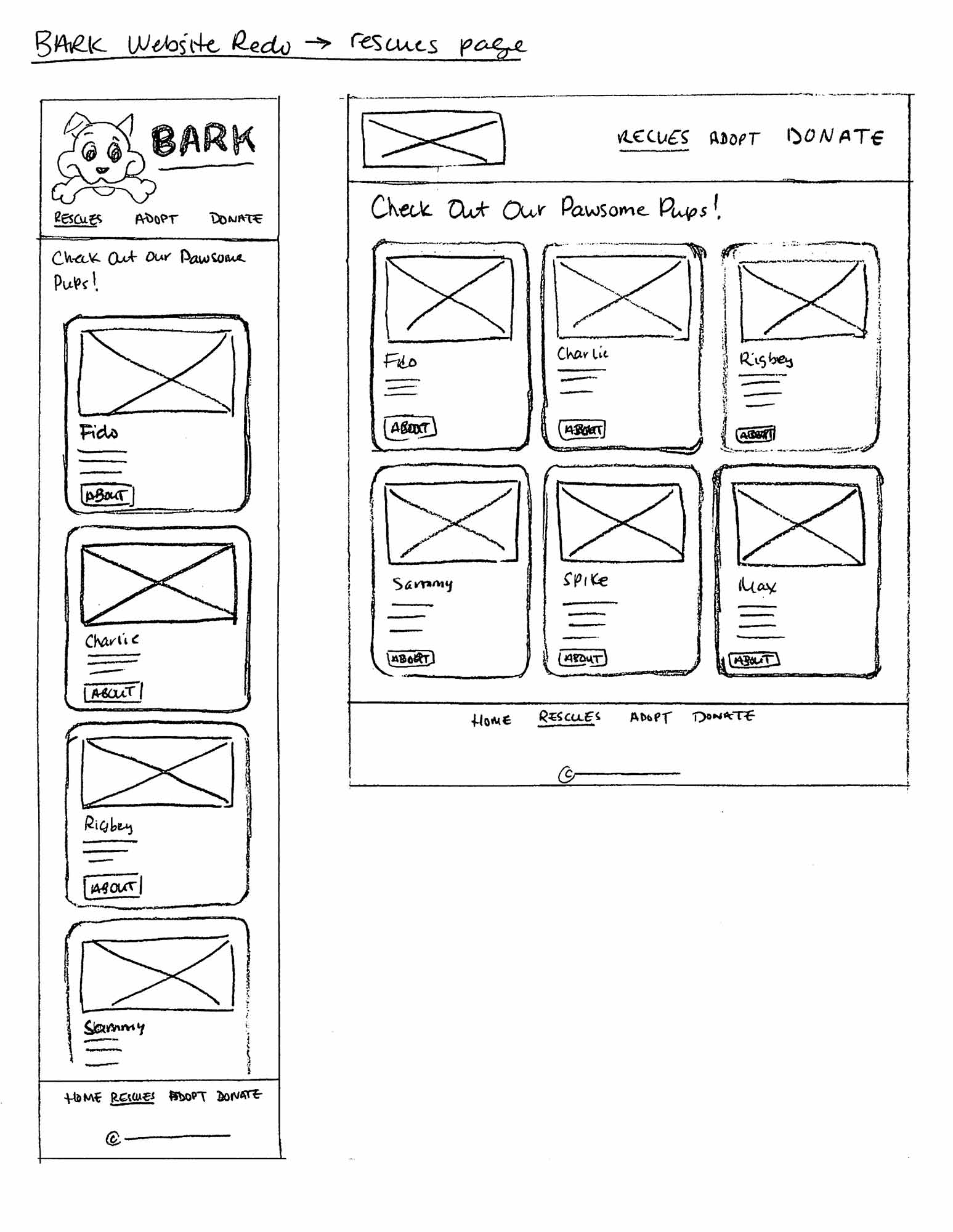
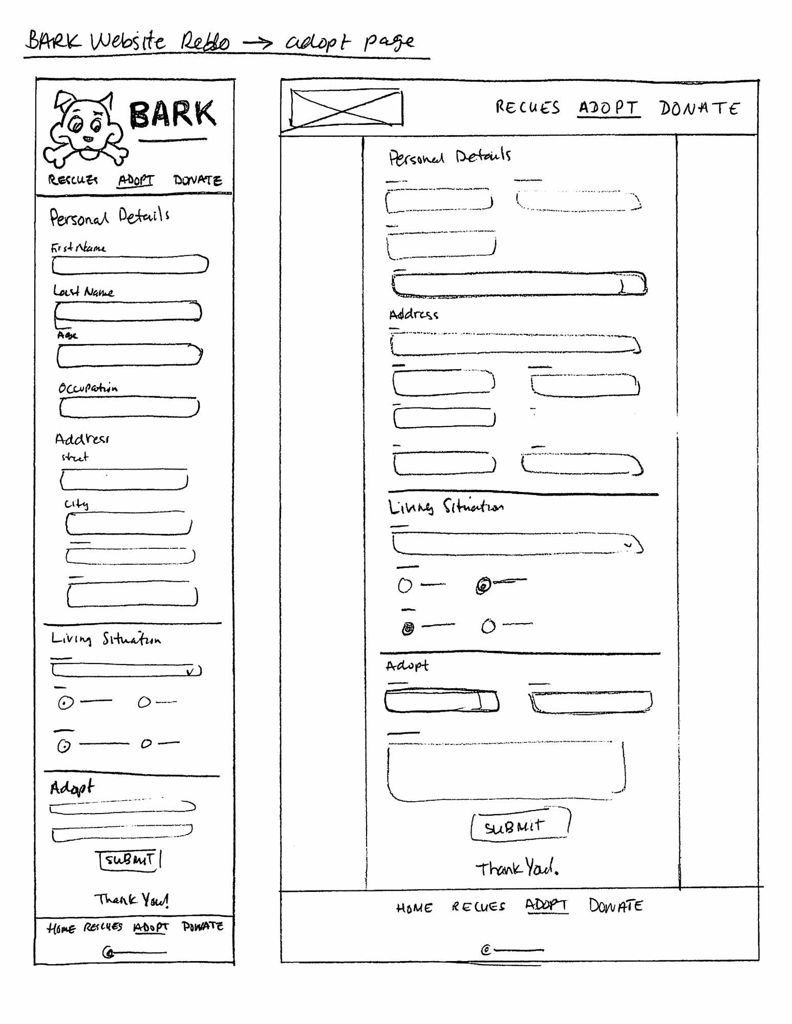
After finishing up the research, I started sketching all the webpages, and the new logo design. I also looked for a new colour palette to fit with the redesign. I went through a few rounds of sketches before I landed on one that I felt would suit B.A.R.K. the best.
Then I went on to the fun part (coding!). I coded each page following my sketches, to create a fun overall brand for B.A.R.K.

Challenges
Making sure everything was good, accessibility wise. Accessibility is important in web design, and I wanted to make sure that the redesign would be accessible for anyone who might use it.
Final Thoughts
I find coding super fun, so I had a great time with this website redesign. I think that the new design brings B.A.R.K. to a new level of professionalism, and will increase their adoption rates. B.A.R.K. is a fantastic rescue organization, and now their website shows that same passion for helping stray dogs.
