Project Description
Lowe’s is a hardware store that caters to all your home improvement needs. One of the many things they carry in store are DIY toys and things for kids. Each kit comes with an instruction manual and a list of what you need to make the DIY, so you can shop for the pieces in store.
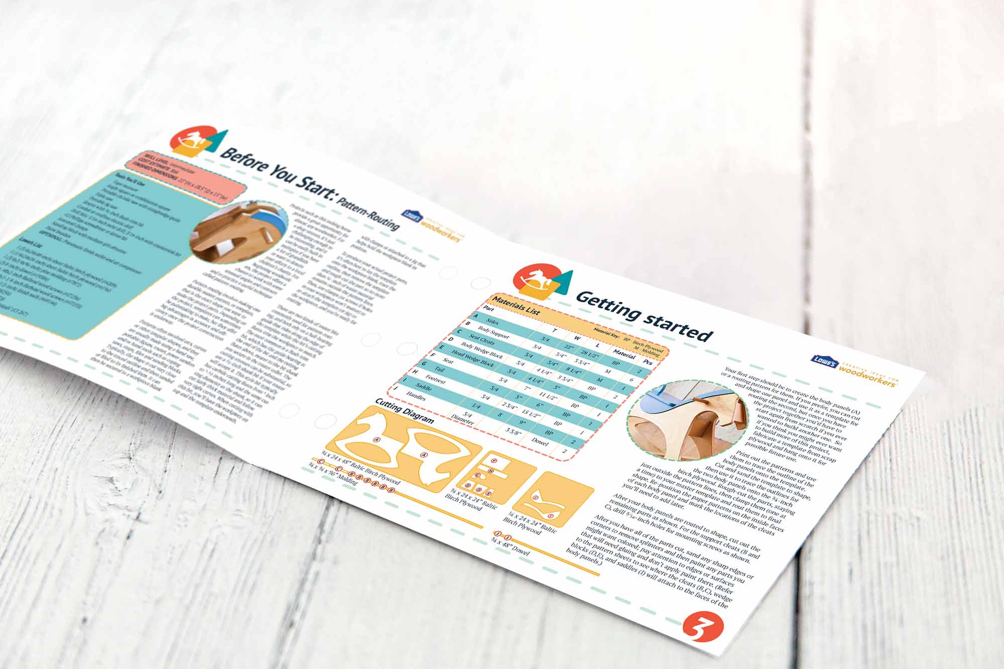
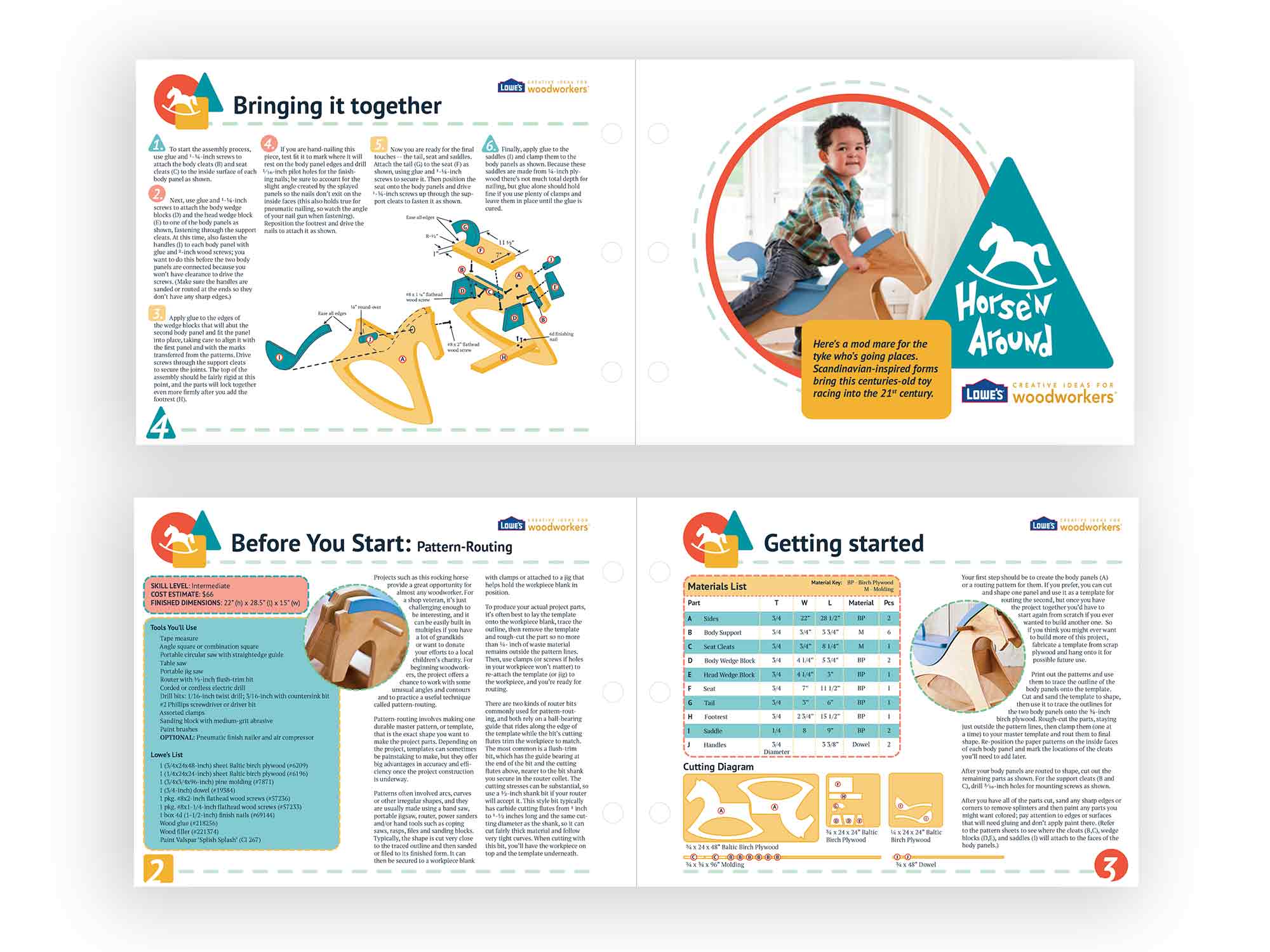
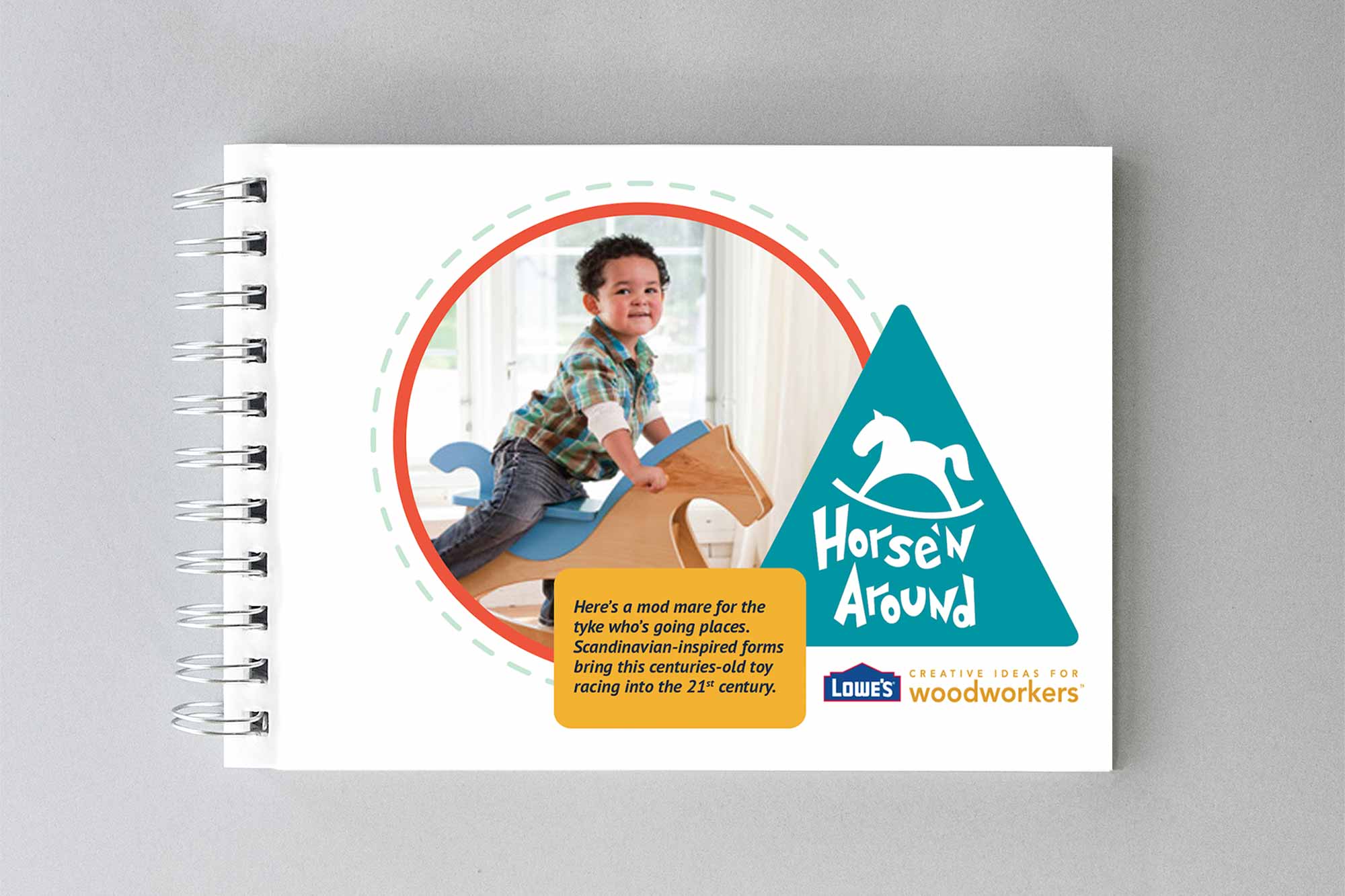
Lowe’s has designed a rocking horse toy for kids, and wants a fun name for the toy and an instruction manual to match. The instruction manual will include all the build instruction, item list, photos of the toy, and cutting and building illustrations.
Deliverables
- Product name and logo, cutting and building diagrams
- 7” x 18” flat double-sided booklet (folded in half)
My Goals
My goals are to create a playful design that fits with the product and lets potential buyers know who the product is intended for. I want the design to feel like the DIY toy is for kids.
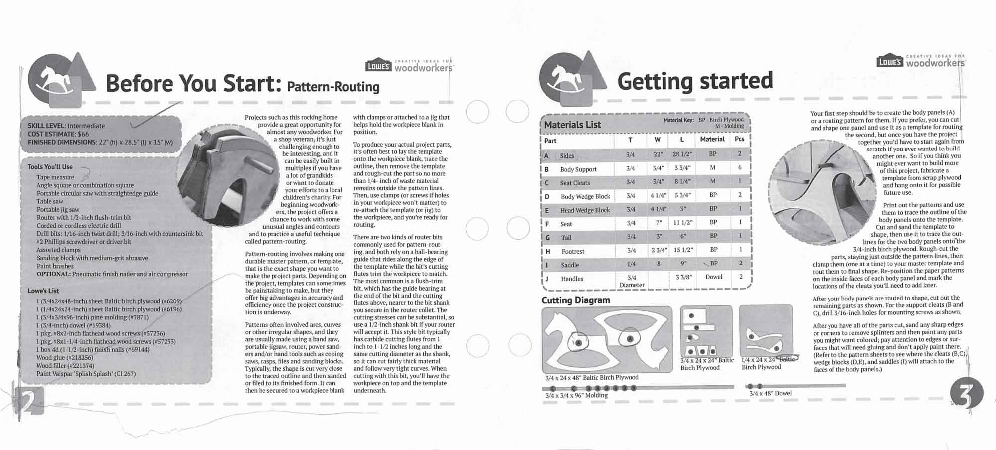
The Process
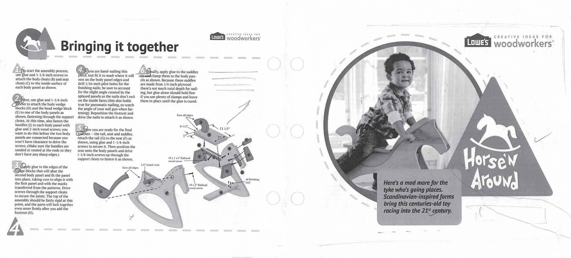
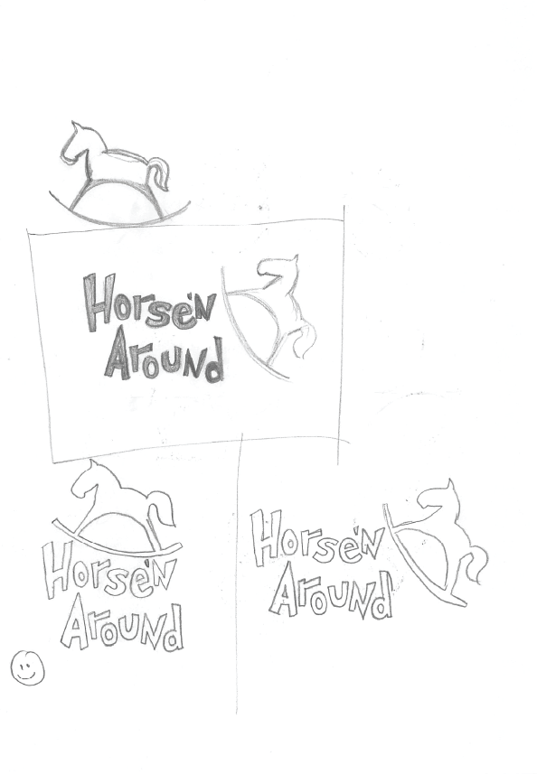
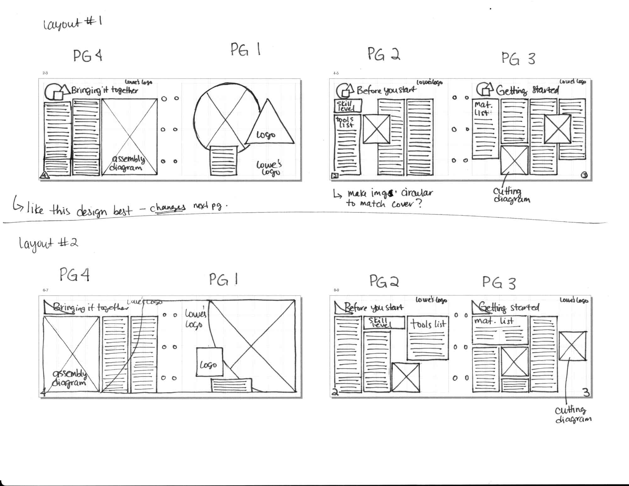
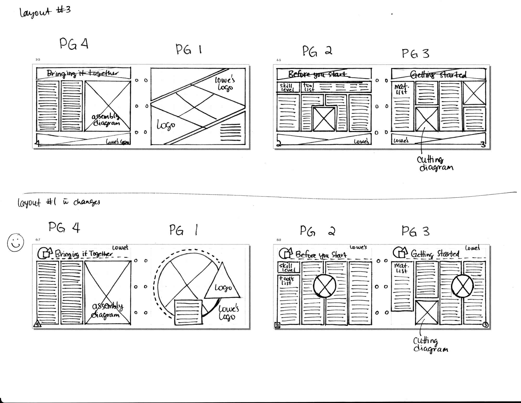
To start the design process, (as always) I started with sketching to get all of my ideas on paper. I first started with figuring out a fun name for the rocking horse toy, I wanted a name that would be easy to remember and clever. So, I landed on Horse’n Around. I felt it fit well with the horse theme toy and made it seem like something fun to buy. After I picked the name, I started sketching the logo, and some layout design ideas.
After getting both the layout sketches and logo sketches approved, I created the cutting and building diagrams in Illustrator, adding my playful colour scheme to the designs. Once all my illustrations were complete, I was able to start building my fun, playful instruction manual.
Using InDesign, I created the instructional manual/booklet. I created the various paragraph styles, and created and styled the tables. With the document set up, I added all my illustration, elements, and text to create my fun design.

Challenges
The size of the manual is quite small and there was quite a bit of content needed, and trying to get the spacing of elements proved a little tricky.
Final Thoughts
I really enjoyed designing this instruction manual. I think the final design turned out really colourful and fun. The design feels very child-like, and I think if a parent was walking through Lowe’s and saw this DIY, they would want to pick it up and see what it’s all about.
